Website
Website
Website

About the project

Future Experience Lab is an innovation initiative to strengthen the experience destination Gothenburg with a special focus on hybrid experiences that contribute to societal change. This project was a collaboration between Gothenburg City, Future Experience Lab and YRGO. The design was made by Samuel Thalin and Linnea Calmstierna. The web development was made by Emma Hansson and Patrik Staaf.

Research

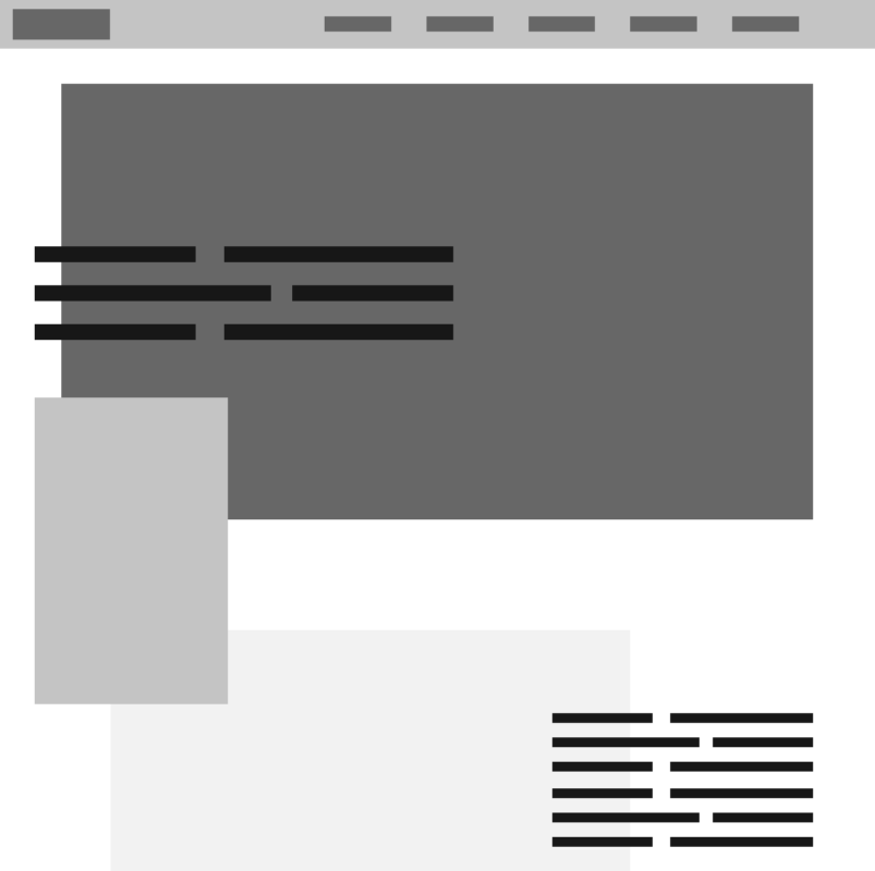
We started the project by having a meeting with the client. After their brief we did a lot of research. We searched for images, apps and websites with ”PUNK” style as the client asked for. We made a flowchart and wireframes. 

Insights

Early in the process we did user tests. We asked users to move between different steps on the website. After their response we made som changes to make the website more user-friendly. For example, we moved the buttons in the mobile menu from top to the bottom. It made it easier for the user to hit the buttons while scrolling.

Flowchart

Greybox
User Interface

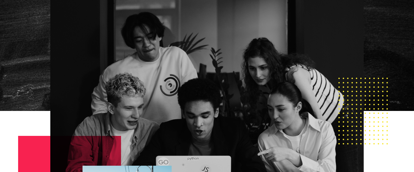
According to the customers wishes, we have created a website with a lot of attitude. The images and texts overlap each other and together with geometric shapes and strong colors it create a playful and professional design.
Inspiration

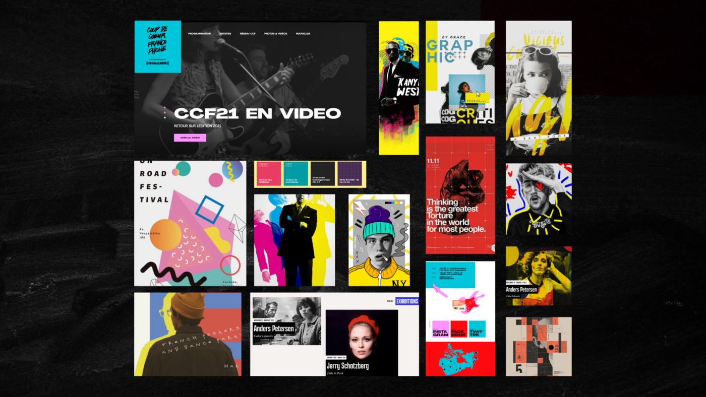
Our inspiration is taken from Pinterest and Street Art.

Photos

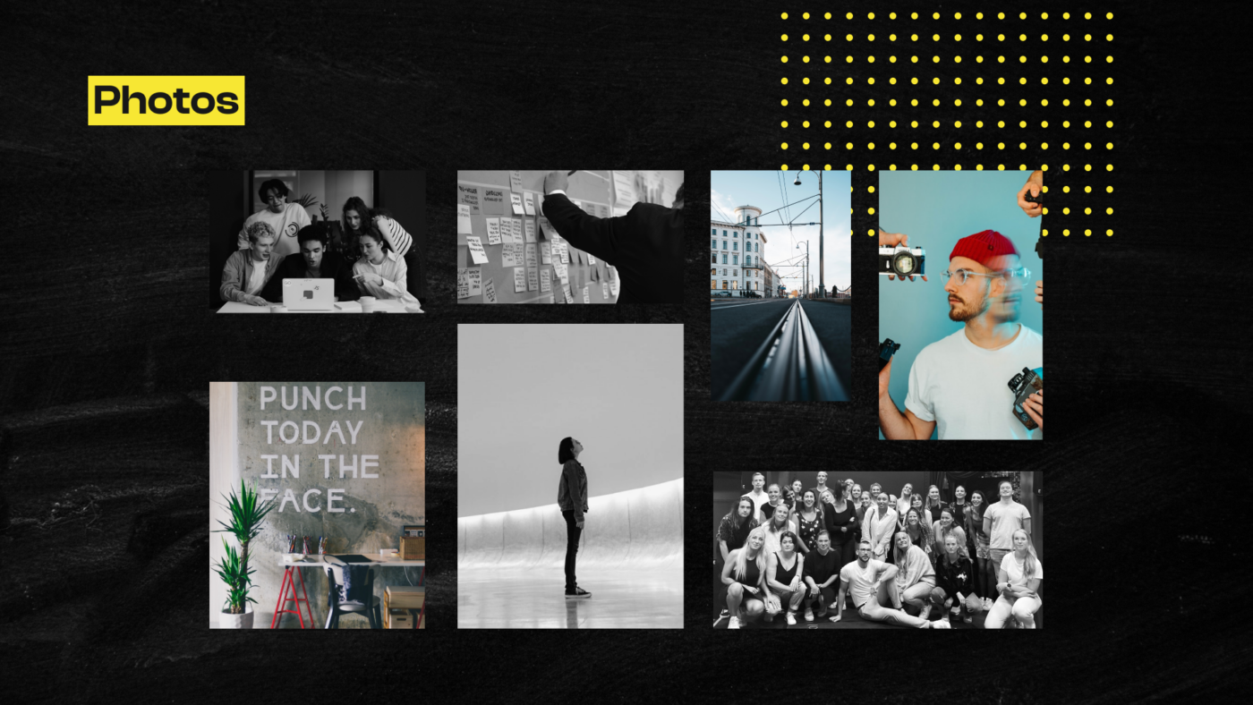
We combined black and white images with dimmed color images. The photos and the colors creates an attitude reminiscent of concrete blocks with graffiti.
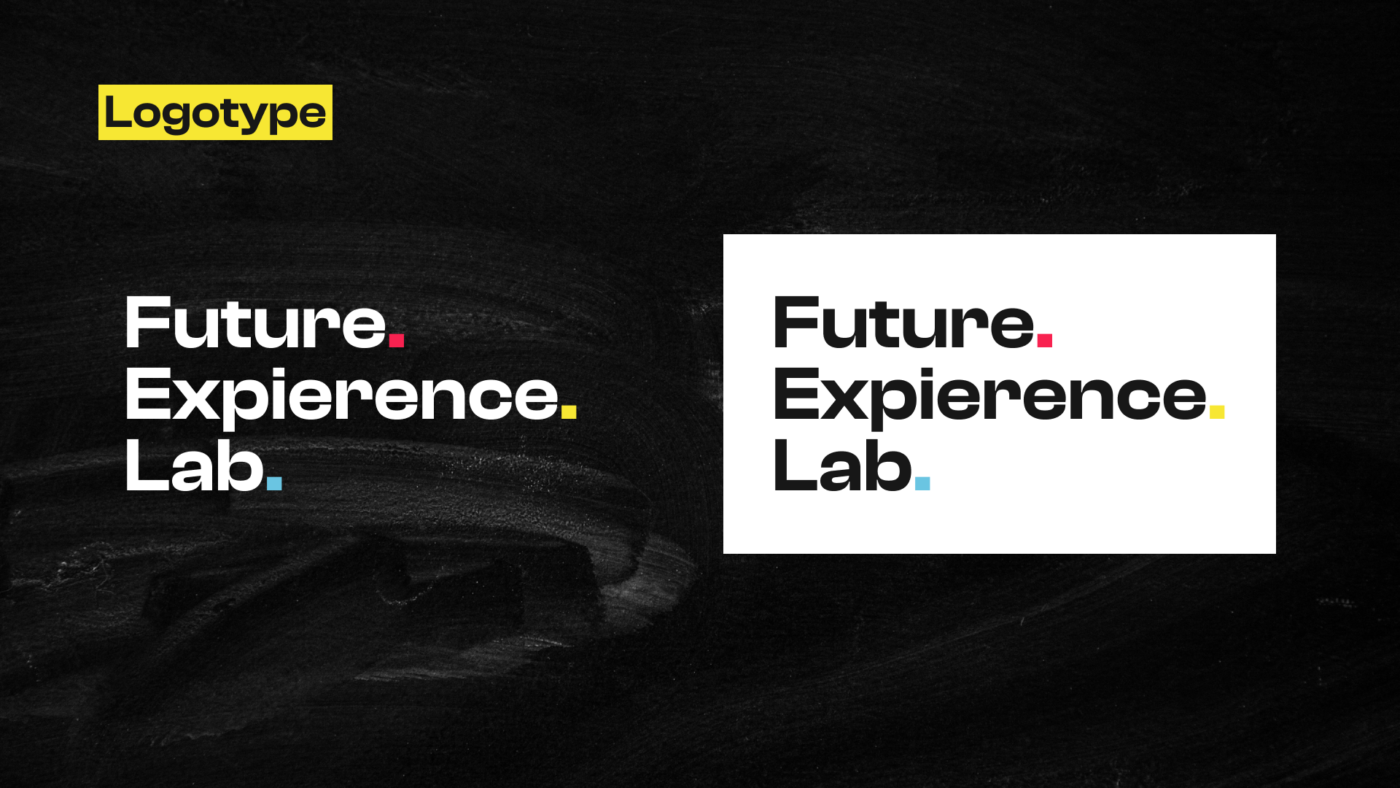
Logotype

We kept the original logo but added colored dots.
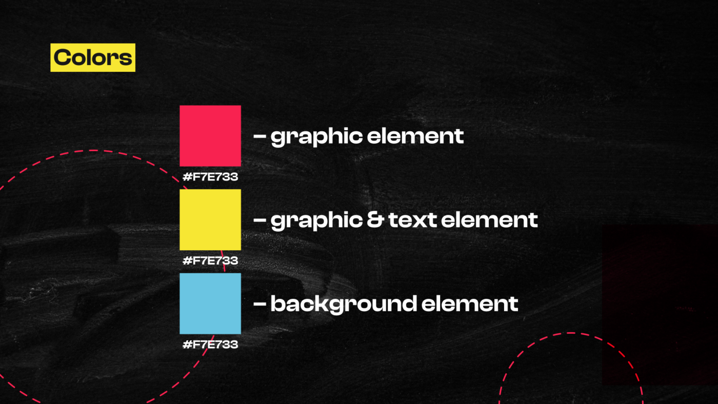
Colors

Playful, loud colors in red, yellow and blue. The idea with these three colors is that they should be visible together in every composition on the website.
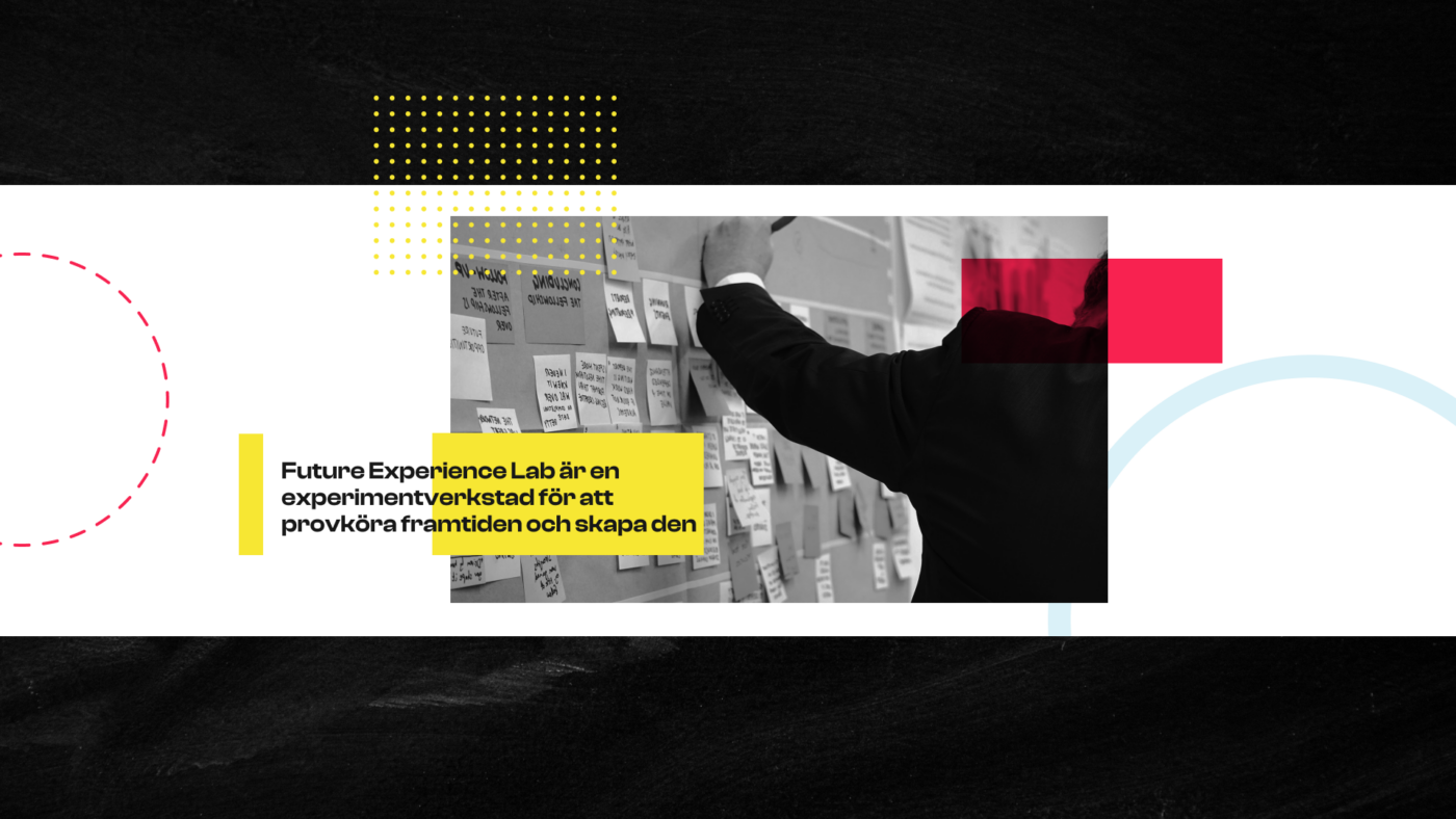
Graphic elements

The colors are applied to graphic elements.
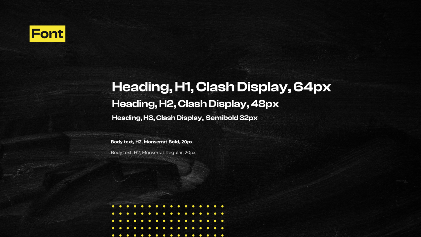
Font

We have used fonts that have round shapes and angular corners. The fonts gives a tough punk feeling while having high readability.

About the project

Future Experience Lab is an innovation initiative to strengthen the experience destination Gothenburg with a special focus on hybrid experiences that contribute to societal change. This project was a collaboration between Gothenburg City, Future Experience Lab and YRGO. The design was made by Samuel Thalin and Linnea Calmstierna. The web development was made by Emma Hansson and Patrik Staaf.

Research

We started the project by having a meeting with the client. After their brief we did a lot of research. We searched for images, apps and websites with ”PUNK” style as the client asked for. We made a flowchart and wireframes. 

Insights

Early in the process we did user tests. We asked users to move between different steps on the website. After their response we made som changes to make the website more user-friendly. For example, we moved the buttons in the mobile menu from top to the bottom. It made it easier for the user to hit the buttons while scrolling.

Flowchart

Greybox

User Interface

USER INTERFACE

According to the customers wishes, we have created a website with a lot of attitude. The images and texts overlap each other and together with geometric shapes and strong colors it create a playful and professional design.

Inspiration

Our inspiration is taken from Pinterest and Street Art.

Photos

We combined black and white images with dimmed color images. The photos and the colors creates an attitude reminiscent of concrete blocks with graffiti.

Logotype

We kept the original logo but added colored dots.

Colors

Playful, loud colors in red, yellow and blue. The idea with these three colors is that they should be visible together in every composition on the website.

Graphic elements

The colors are applied to graphic elements.

Font

We have used fonts that have round shapes and angular corners. The fonts gives a tough punk feeling while having high readability.

About the project

Future Experience Lab is an innovation initiative to strengthen the experience destination Gothenburg with a special focus on hybrid experiences that contribute to societal change. This project was a collaboration between Gothenburg City, Future Experience Lab and YRGO. The design was made by Samuel Thalin and Linnea Calmstierna. The web development was made by Emma Hansson and Patrik Staaf.

Research

We started the project by having a meeting with the client. After their brief we did a lot of research. We searched for images, apps and websites with ”PUNK” style as the client asked for. We made a flowchart and wireframes. 

Insights

Early in the process we did user tests. We asked users to move between different steps on the website. After their response we made som changes to make the website more user-friendly. For example, we moved the buttons in the mobile menu from top to the bottom. It made it easier for the user to hit the buttons while scrolling.

Flowchart

Greybox

User Interface

According to the customers wishes, we have created a website with a lot of attitude. The images and texts overlap each other and together with geometric shapes and strong colors it create a playful and professional design.

USER INTERFACE

Inspiration

Our inspiration is taken from Pinterest and Street Art.

Photos

We combined black and white images with dimmed color images. The photos and the colors creates an attitude reminiscent of concrete blocks with graffiti.

Logotype

We kept the original logo but added colored dots.

Colors

Playful, loud colors in red, yellow and blue. The idea with these three colors is that they should be visible together in every composition on the website.

Graphic elements

The colors are applied to graphic elements.

Font

We have used fonts that have round shapes and angular corners. The fonts gives a tough punk feeling while having high readability.